

A Checkbox Should Change the World
When was the last time clicking a checkbox made you feel like a superhero? If you’re struggling to remember, that’s exactly the problem with modern software design. In the software industry, it seems that some companies have lost their way regarding User Interface, User Experience, and Product Design. These ideas have been hijacked, and they often don’t mean what they ought to. This results in weaker products, and poor usability. Good product design makes users powerful. Great products make it easy to do big things with small, nearly effortless actions. Clicking a checkbox on or off ought to change the world. Let me explain.

What is a product? A product is something available for purchase or subscription that is designed to solve a real-world problem. Good products make it easy for the product users to solve challenging problems. Great products make it nearly effortless to solve challenging problems. Poor products don’t help much with the real problem, or potentially make it even more troublesome to solve the problem than without them.
One of the terms I use for poor products that don’t really help are “contrivances”. Consider an Orange Peeler, for example. If the job to be done is to open an orange while leaving the inner fruit intact, then an orange peeler designed to be a solution to that problem. If you were to peel an orange without an orange peeler, the process would be this:
- Get the orange
- Open the top
- Peel the orange with your hands until it’s peeled
- Throw away the orange peels
- Enjoy the orange

What is the workflow with an orange peeler?
- Get the orange
- Dig through your kitchen drawers to find the peeler
- Open the top with the peeler
- Peel the remainder of the orange with the peeler
- Throw away the orange peeler
- Enjoy the orange
Is the workflow improved from using an orange peeler? Yes and no. On one hand, the main phase of actually peeling of the orange is slightly easier with the peeler. However, an additional step is also required in the workflow, in locating and getting the orange peeler in the kitchen. There is a further benefit that the orange peels do LOOK nicer when using a peeler, compared to hand-peeling. Considering a whole cost-benefit analysis we see this
Benefits:
- Nicer-looking orange peel
- Slightly easier peeling process
Costs:
- One additional workflow step
- One additional tool dependency
Is the orange peeler a useful product? Realistically, unless your goal is to use nice-looking orange peels for garnish, product photos, or as an ingredient, then the orange peeler is of no advantage. In fact, it arguably complicates your kitchen life and orange-eating experience.
Just as we critically examined this simple kitchen tool, we must apply the same rigorous analysis to software products - but with even higher stakes. After all, while an orange peeler might waste a few seconds of your time, poorly designed software can waste hours of thousands of users’ lives.
The same product analysis can be run on ANY product that’s meant to be a tool or serve a functional purpose. This is especially important for the design of software products. A great software product either enables a user to do something that wasn’t previously possible, or it ought to make something that was previously possible easier and more effortless.
This may have gotten lost with the rise of UI and UX designers, who later branded themselves as Product Designers. User Interface design is a highly useful skill. Great User Interfaces make it very easy for users to know what capabilities they have, and interact with the capabilities. Great users interfaces are USEFUL. While there is some aesthetic quality that matters, great UI Designers are primarily functionally-oriented and not artistically-oriented. If you have a great product that has a highly legible and powerful user interface, that product is highly impactful.
But we also see UI Designers focusing on the wrong attributes. Sometimes they can be focused on exactly how much padding ought to be between elements in a component. How rounded are the corners? How nested are the powerful interactions (since we don’t want to confront the user with too many choices)? Do we have a beautiful dark mode theme? Do we love the Header fonts?
As an artist, I love beautiful things. Given two otherwise identical products, with one beautiful and the other ugly, I like the beautiful one better. Everyone does. But if the products are NOT identical, then as a user, as a steward, as a capitalist, as a finite human with a limited lifespan, I would ALWAYS choose the more powerful product, so long as it’s usable. Most rational people would choose the same. Therefore, functionality is more valuable than decoration, in the realm of utility products.
Product Design Philosophy
This has significant implications for creators. As a software creator, most of your effort and resources ought to be channeled into the efficacy, clarity, and usability of your product. Only a small amount of resource ought to be channeled into the beauty or “moderness” of your product. If we consider the Pareto principle, we ought to be allocating at least 80% of our resources into the power of the product.
How do we make our products more powerful? There are fundamentally three paths to more power.
- Add a new product capability
- Improve the impact of a current product capability
- Decrease the user-effort of a current product capability
If we apply that design philosophy, and we already have a product that does one useful thing, then the pathway to a great product is to apply ourselves towards #2 and #3. We should make the impact of the product higher, and the user-effort requirement lower. If you have a great product, then your UI flows and forms will have very few elements, and each of those elements will have a massive impact on the world.
Clicking a single checkbox ought to change the world in a meaningful way for a user.
Examples
What are some great examples of high-power UI?
- Trading Websites
- Can I buy 100,000 shares of a symbol with just a couple field entries and a button press?
- Financial Applications
- Can I send money to family member in minutes, with just specifying a recipient and a number?
- Retailer Delivery
- Can I have someone deliver products to my doorstep with 1 or 0 selections in a checkout flow?
- Advertising Opt-Out
- Can I unsubscribe from physical mailers with a single click or web URL?
- eCommerce
- Can I setup a yearly subscription by just connecting my credit card and clicking “Yes”?
- Social Media
- Can I share content with my entire network with a single tap?
- Smart Home
- Can I secure my entire house by pressing one “Away” button?
- Project Management
- Can I approve and kickoff an entire project phase with a single status change?
- Cloud Infrastructure
- Can I scale my entire application infrastructure up or down with a single configuration change?
- Healthcare Portals
- Can I schedule multiple related appointments across providers with a single booking action?
What are some examples of low-power UI?
- Accept Terms of Service Checkboxes
- If the terms are long, there is virtually zero chance the user read or understood. These often don’t even hold up legally
- Get Support Widgets that don’t have a Talk to Human Option
- In many cases these don’t solve the users’ problem, while wasting a LOT of time serving up irrelevant and outdated documents
- Mandatory Form Fields that only result in Reshowing the Provided information
- The app collected some data, and the only point of the data is to show it back to the user in the UI
- Forgetful User Interface
- You configure some view or setting, and every time you return to the same page, you have to configure it again the same way
- Complicated Unsubscribe Workflows
- These are not only high-friction, but also arguably immoral. They make users take many actions to discontinue a recurring payment.
- Password Managers with Poor Autofill
- Having to manually copy/paste credentials defeats the core purpose of password management automation
- Multi-Step Wizards for Simple Tasks
- When a single form could collect all needed information, forcing users through 5+ steps is inefficient
- Cookie Consent Banners with No “Reject All” Option
- Forces users to manually toggle dozens of switches to opt out of tracking
- File Upload Interfaces with No Drag-and-Drop
- Making users click through file explorers when drag-and-drop is an expected standard
- Notification Settings that Reset After Updates
- Users carefully configure their preferences only to have them wiped out after app updates
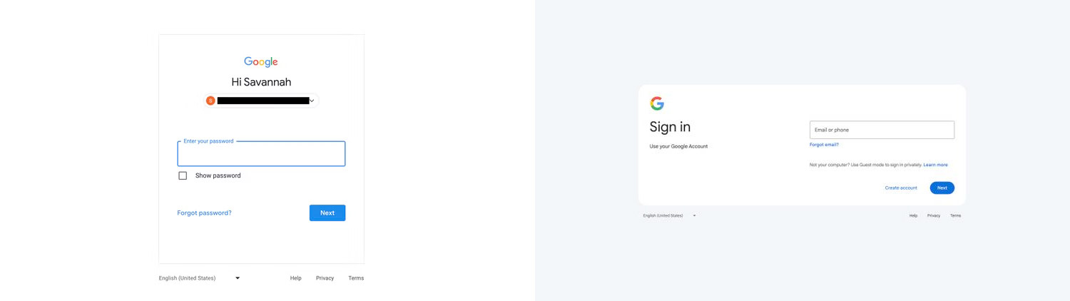
UI Revamps that don’t improve the product are rightly mocked by those who see the waste of valuable creative resources. Creative energies can and ought to be primarily applied to genuine utility improvements. We recently saw Google experience a lot of criticism for their login page redesign. If you can improve the product and also the aesthetics at the same time, that can be a win. But it’s essential to NEVER lose sight of the key company mandate and mission to improve life and work for your users.
Counterintuitively, some of the most powerful interfaces in history have been text-based. The UNIX command line can reshape entire systems with a single command. The lesson? Power isn’t about flashy graphics - it’s about leverage.
Summary
Great products fundamentally transform how users interact with and impact the world around them. They amplify human capability, turning small actions into powerful leverage points that create meaningful change. When users engage with truly excellent software, a single click should cascade into significant, real-world outcomes - whether that’s deploying infrastructure, approving projects, or coordinating complex services.
In contrast, poor products create friction and diminish user agency. They trap users in bureaucratic workflows, force repetitive actions, and fail to translate intent into impact. When evolving your products, the north star must always be expanding user capabilities and maximizing the leverage of each interaction.
While visual polish and aesthetics have their place, they should never come at the expense of genuine functional improvements. Think of aesthetics as the finishing touch - important for the overall experience, but secondary to the core value proposition. The most beautiful interface in the world means nothing if it doesn’t empower users to accomplish their goals more effectively.
When directing UI/UX work, ensure your design team deeply understands the product vision and how each interface element serves the larger mission of user empowerment. Every screen, every button, every form should be thoughtfully crafted to amplify user capability and impact.
In the end, this is the true measure of product excellence: A single checkbox click should set in motion meaningful change. One small user action should ripple outward to create real value in the world.
Clicking a checkbox should change the world.