


Nobody Reads the Claude Doc
AI can now write a twelve-page report on anything in under a minute, and nearly every fact in it will be correct. Nobody reads it. The reader skims the headers, forwards it to a teammate, and asks for the short version in a meeting. The best communication in the agent era is a diagram, one sentence that carries the point, and a handful of plain lines that make people believe it.

The Dreaded Claude Doc
You know the one. You ask an agent why checkout broke. Ninety seconds later you get 2,400 words of markdown. Eleven headers. Three tables. An executive summary that is somehow four paragraphs long. A risks section, a timeline, a list of next steps, and an appendix of log excerpts.
Every fact is right. You still have no idea what happened.
That is the dreaded Claude Doc. It shows up everywhere now: incident reports, research summaries, code review notes, planning docs. Writing got free, so agents write everything. Reading stayed expensive, so humans read nothing. The doc lands in Slack, gets a thumbs-up emoji, and dies.
The agent did its job. It found the facts. Then it handed you the job of figuring out which fact matters, and that was the whole job.
Complete Is the Enemy of Clear
Every report has one piece of information the reader actually needs. Usually it fits in a sentence.
Checkout is failing because Tuesday’s deploy cut the tax service timeout from 30 seconds to 8.
That sentence is the report. The other 2,380 words are evidence. Evidence is useful when you doubt the claim. It is noise when you are trying to find the claim.
Agents default to completeness because completeness is safe. Nobody can say the model left something out. But a document that includes everything ranks nothing, and ranking was the reason you asked. Whoever has to pick the one thing that matters is doing the real work. If the agent won’t pick, you will, and you’ll do it slowly while skimming.
One Sentence Feels Wrong
So just send the sentence? Try it. Most people won’t accept it.
We are trained out of single sentences. School assigned five-page minimums. Consulting decks billed by the slide. Somewhere along the way, length became a proxy for effort, and effort became a proxy for truth. Hand someone one sentence and their first reaction is suspicion. Is that it? What did you leave out?
The second problem is worse. A lone sentence often doesn’t land. “The tax timeout dropped to 8 seconds” is perfectly clear to the person who traced it. To everyone else it is a fact with no handles. Which tax service? Why would 8 seconds break my checkout page?
The wall of text fails because it’s indigestible. The bare sentence fails because it’s either rejected or not understood. Both are real. The fix sits between them.
Picture, Sentence, Five Lines
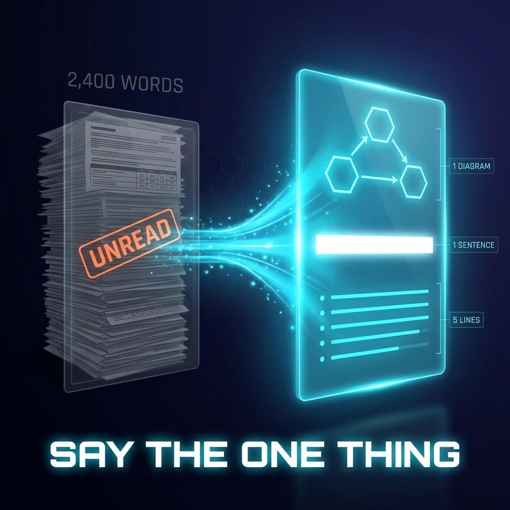
Here is the format that works on almost every human I’ve tested it on.
One diagram. The picture carries the structure. Who talks to whom, and where it broke. People grasp a box-and-arrow drawing in two seconds that would take two paragraphs to describe. I wrote that images carry more intent per second than any paragraph when you are talking to agents. The same is true in the other direction.
One sentence. The key fact, stated as a claim. Put it right next to the picture, so the picture becomes its proof.
Three to five supporting lines. Short, plain English. These exist for trust. They answer the “is that it?” reflex before it fires. What evidence, what impact, what to do next. Five at most, because a sixth line means you’re drifting back toward the wall.
That’s it. The full report can still exist behind a link for the one person who needs to audit it. Most readers never click, and that’s fine.
Say the one thing, then draw it.
Before and After
Before: the 2,400-word incident doc. Read by two people out of fourteen. Discussed in a 30-minute meeting where someone asked the agent’s question again, out loud.
After:
Tue deploy ──> tax-service config ──> timeout 30s → 8s
                                              │
                         EU tax lookups take 9-12s at peak
                                              │
                                    checkout returns 500
Checkout is failing because Tuesday’s deploy cut the tax service timeout from 30 seconds to 8.
- Only EU orders fail. US lookups finish in under 2 seconds.
- 1,140 failed checkouts since Tuesday, about $86K in delayed revenue.
- The change came from a shared config file, not the tax service team.
- Fix: restore 30s now, add a timeout test to the config pipeline.
Everyone reads that. It takes forty seconds. Nobody asks for a meeting, because there is nothing left to explain. The back-and-forth never starts.
Tell Your Agents
None of this happens by default. Every model I use leans toward the wall. You get the AI you ask for, so ask for this:
Lead with one sentence: the single fact the reader needs. Include a diagram. Follow with at most five short supporting lines. Put everything else in an appendix or a linked file.
Put it in your agent rules, not in each prompt. When the agent slips back into eleven headers, send it back. Deciding the shape of what comes out is part of building the agent workspace.
This matters more as you scale. One agent writing walls of text is annoying. A dozen agents working while you sleep and each leaving you a twelve-page report means you wake up to a reading backlog you will never clear. Your morning should be a stack of pictures and sentences you can review like a product and act on in ten minutes.
Nobody ever wanted a chatbot. Nobody wants its report either. They want to know what happened and what to do about it.
One picture. One sentence. Five lines at most.